Introduction
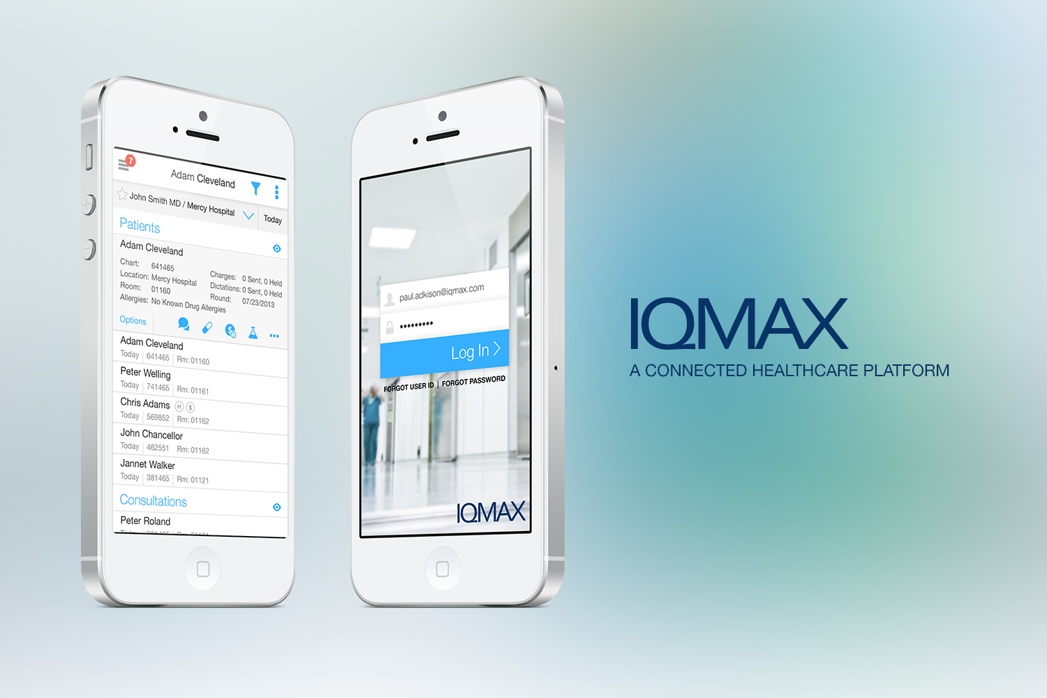
IQMax's connected healthcare platform support physician workflows by facilitating real-time communications, group messaging, and image and file sharing with full HIPAA compliance. They connect to over 50 different systems in healthcare and support millions of patient encounters in a wide variety of healthcare specialties.
The Problem
IQMax had a functioning app that had more API’s than you could count plugged into many different healthcare systems pulling data together for their users. What they didn’t have was a usable interface that would work across multiple screen sizes and devices. Users were admittedly lost among the multiple different types of navigation interfaces that were created by engineers that weren’t sure how to properly surface data to their users. Also missing was a modern messaging interface that users were familiar with using on their phones making it difficult to quickly communicate patient problems.
The Discovery Workshop
Six Studios met with IQMax in their headquarters in Charlotte, NC to initiate the design process with a 2 day kick-off workshop. The workshop was dedicated to discovery and user interviews to properly understand the scope and depth of IQMax's current product application, pinpoint user pain points as well as establish goals for the project.
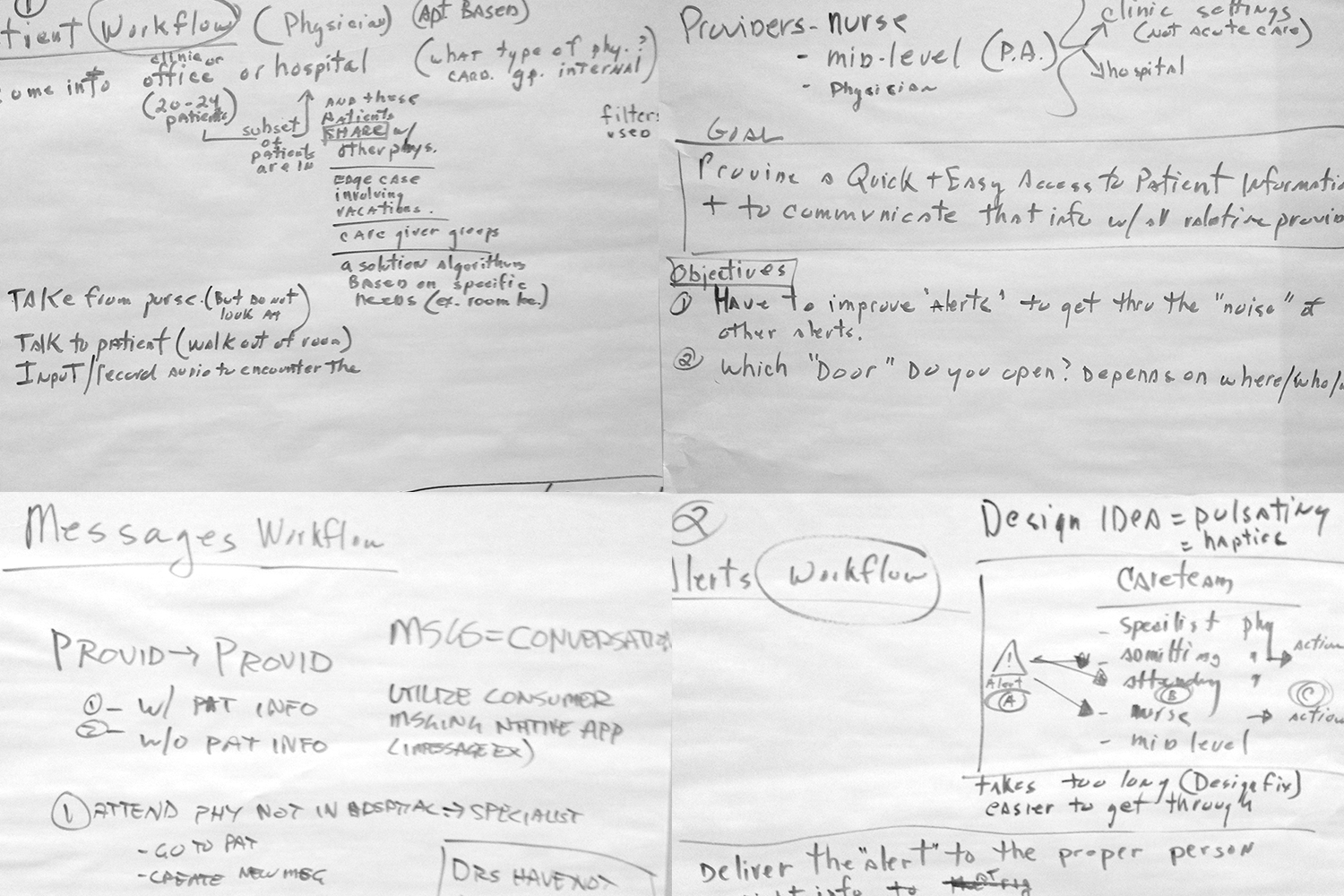
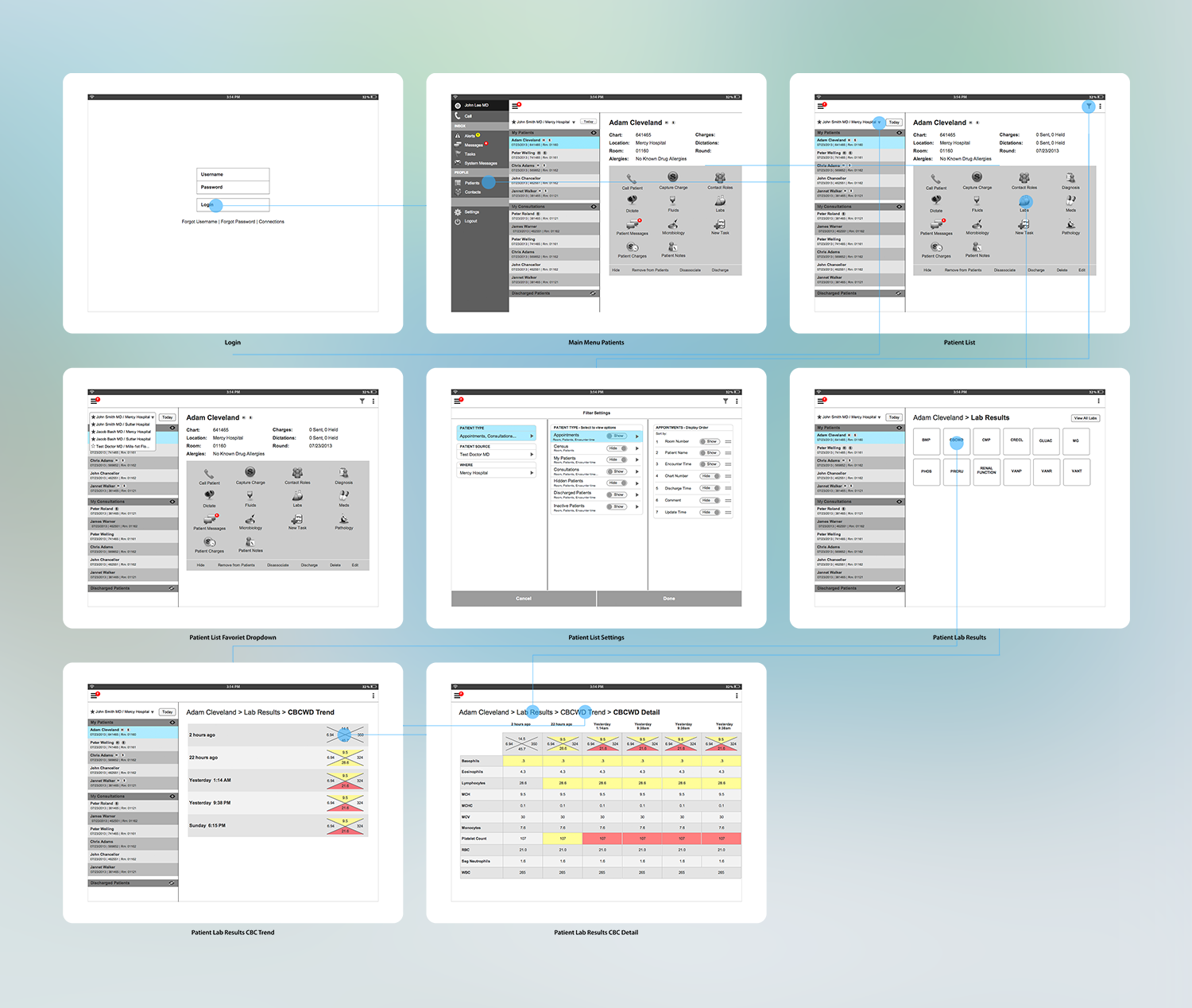
From the workshop, it was determined that there were 2 major areas to the application: patient information and messaging. It was clear the entire flow and presentation of patients and patient information would need to be rethought. For messaging, we needed to follow established messaging design paradigms that users were already used to with their phones. However, the challenge was how to modify these patterns in a way to incorporate the needs of the healthcare providers such as tagging patient information and creating a system of alerts.
Furthermore, the application would need to accommodate the needs of just not doctors, but also nurses, other caregivers and administrative staff as well. We needed to consider how to ensure that patient views would be appropriate and accessible for each.
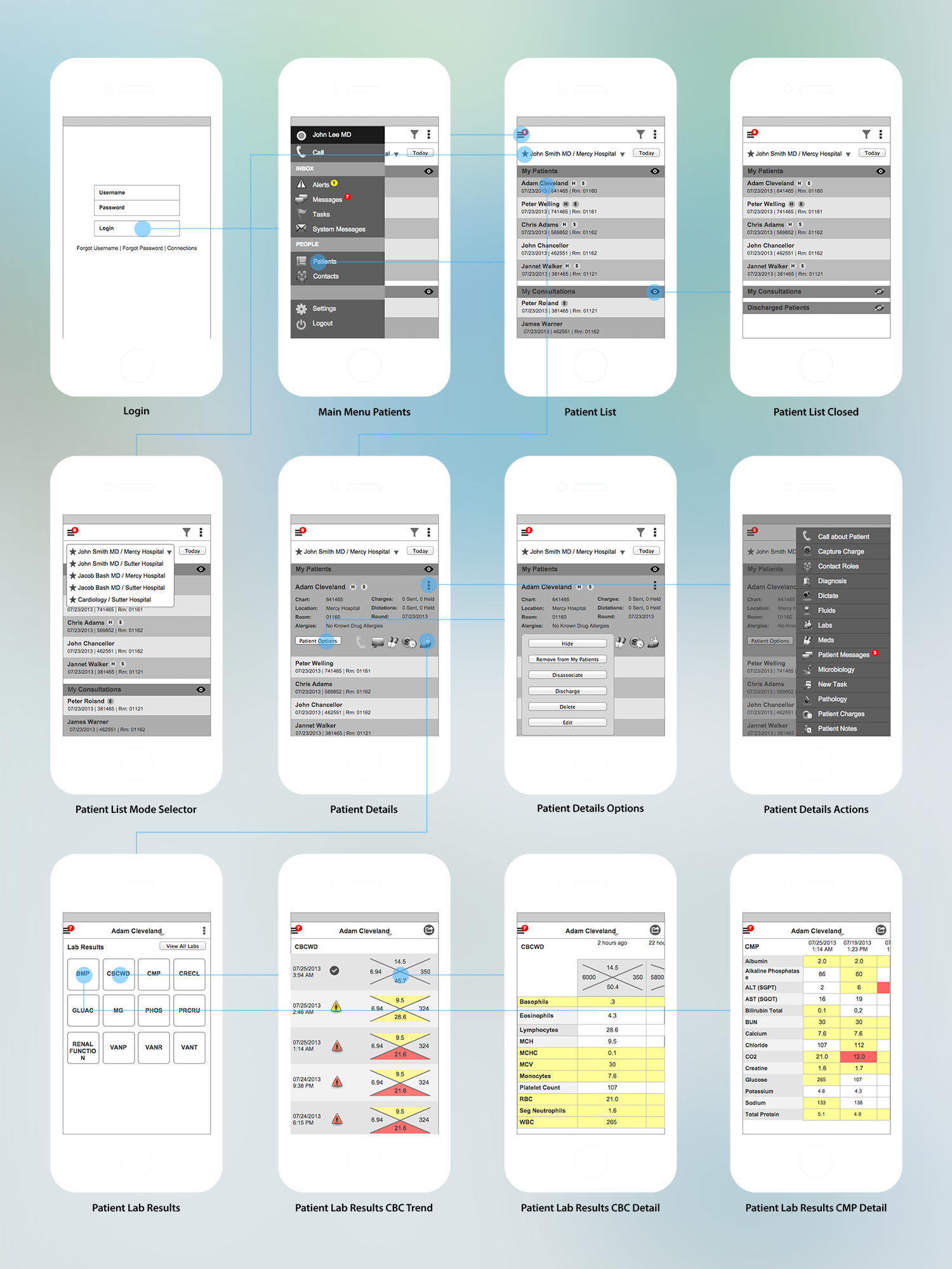
The patient labs view was an important use of the application for many doctors. They could remotely view and monitor their patients lab work. The labs view was in need of a major redesign. The core values that they needed to see were often lost in a sea of null results making them hard to find and compare.
My Role
I worked together with a project manager that was responsible for much of the workshop and post-workshop coordination and communication. I was the main UX designer responsible for the research, concept, wireframes and visual design.
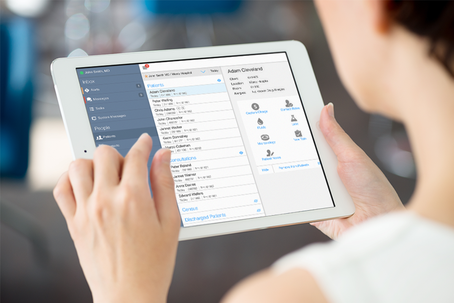
Built with Multiple Devices and Users in Mind
Wireframes, flow charts and prototypes were created at each step of the way to ensure usability and sound design principles. User testing was conducted with prototypes in sync with the design through an iterative feedback loop process. We collected feedback from both IQMax team members and partner nurses and doctors.
Some Key Insights Gained from User Testing
There were a few key pieces of feedback that were provided by the nurses and doctors about the lab results screens (seen above). First, they wanted to see within each test the trend of the data over time. So we showed the data against a timeline in both the trend and detail lab results screens. Second, for many labs there is a shorthand (the X diagram above with 4 values) view of the lab that nurses and doctors understand to be the most important values related to a certain lab result. We applied our color coding to these shorthand diagrams for easy and quick comprehension of the data.
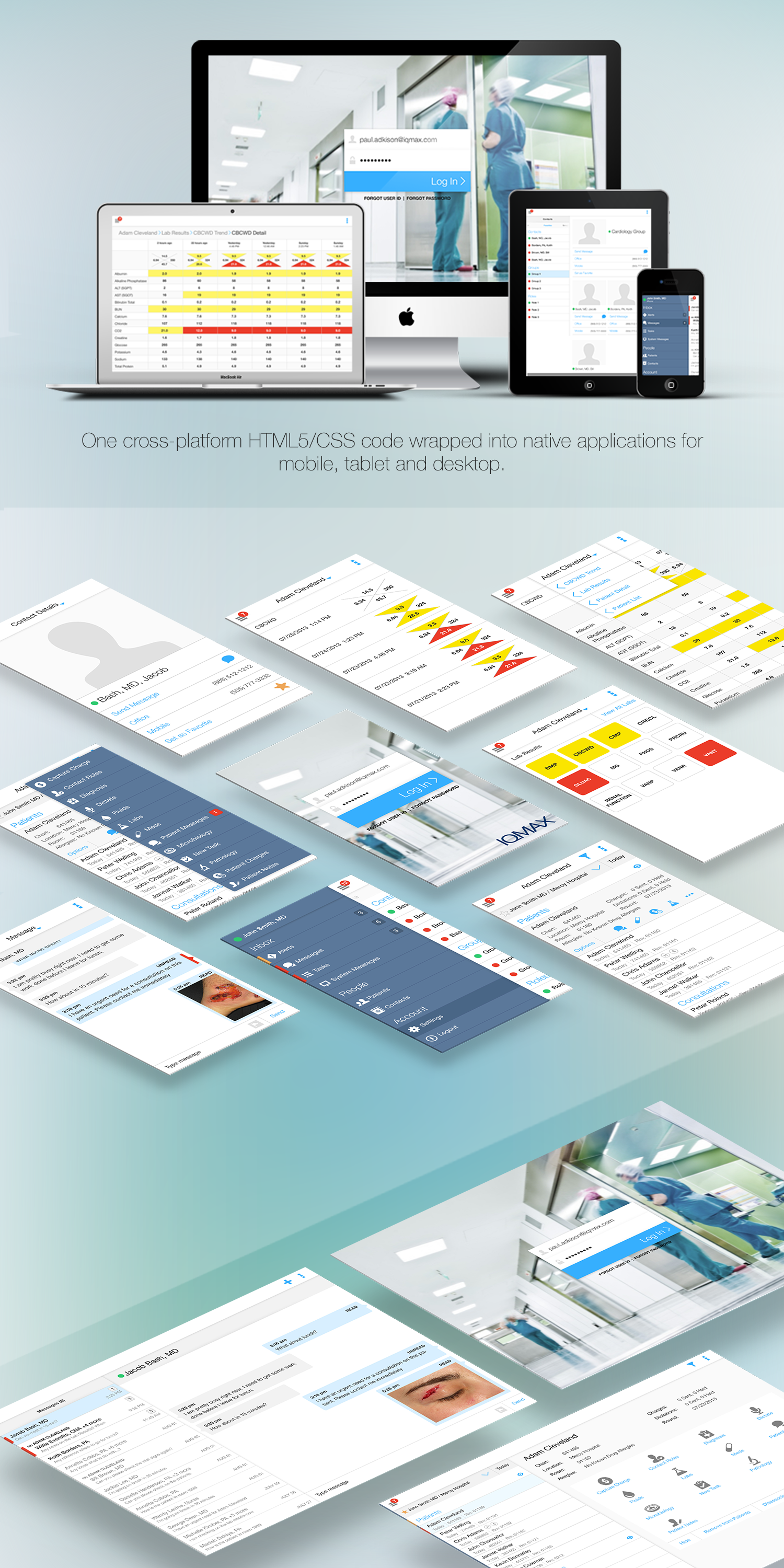
This user-centered design approach and iterative design process resulted in the a clean interface with a modern navigation that worked on both Apple iOS and Android OS. The results convinced IQMax of the benefits of the new UI paradigm. Using an agile and iterative design process with IQMax, we completed the interaction design for the IQMax application suite of products. The visual design was also completed with the same process resulting in a fresh and modern user interface.
The Visual Design
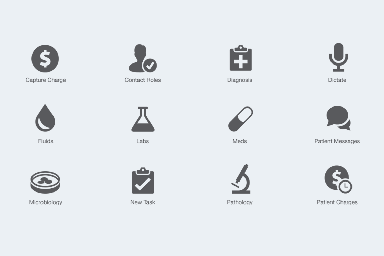
Custom Icon Design