Amazon Publisher Custom Reporting
Role: UX Design Lead
Teams: Product Management, Engineering, Account Managers, Marketing
For our customers, the data reporting feature in the Amazon Publishers Services portal is by far the most important and most used feature. It is essential for tracking earnings, troubleshooting issues, and finding opportunities to optimize monetization.
At the time, the reporting feature was in dire need of an upgrade. The data infrastructure was outdated, causing significant downtime and reporting delays. The reporting UI only offered separate, siloed reports. Some data metrics appeared in some reports but not in others, and some reports contained the same metric but used different names.
Although we offered an option for offline data collection from AWS cloud storage, it was available only to select publishers, and even then, the offline and online data were inconsistent.
Working with a Product Manager, engineers, and account managers, we set out to reimagine the reporting experience for our customers.
The Design
The User Journey
To start, we leveraged the basic CRUD design pattern from the APS UX Design Pattern Library. The core user journey for reporting is shown here.
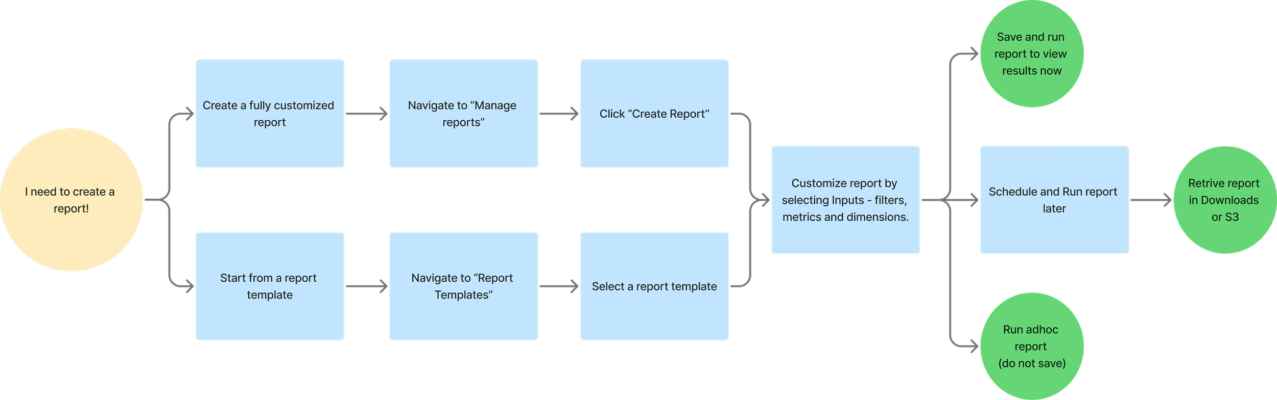
The Basic Framework – Report Creation
From years of feedback of our old reporting systems and insights from competitive analysis, we compiled a list of key report creation features to prioritize:
Ability to create fully customized reports
Ability to schedule reports
Offline retrieval of reports
Reduced data reporting lag
Minimized downtime and reporting delays
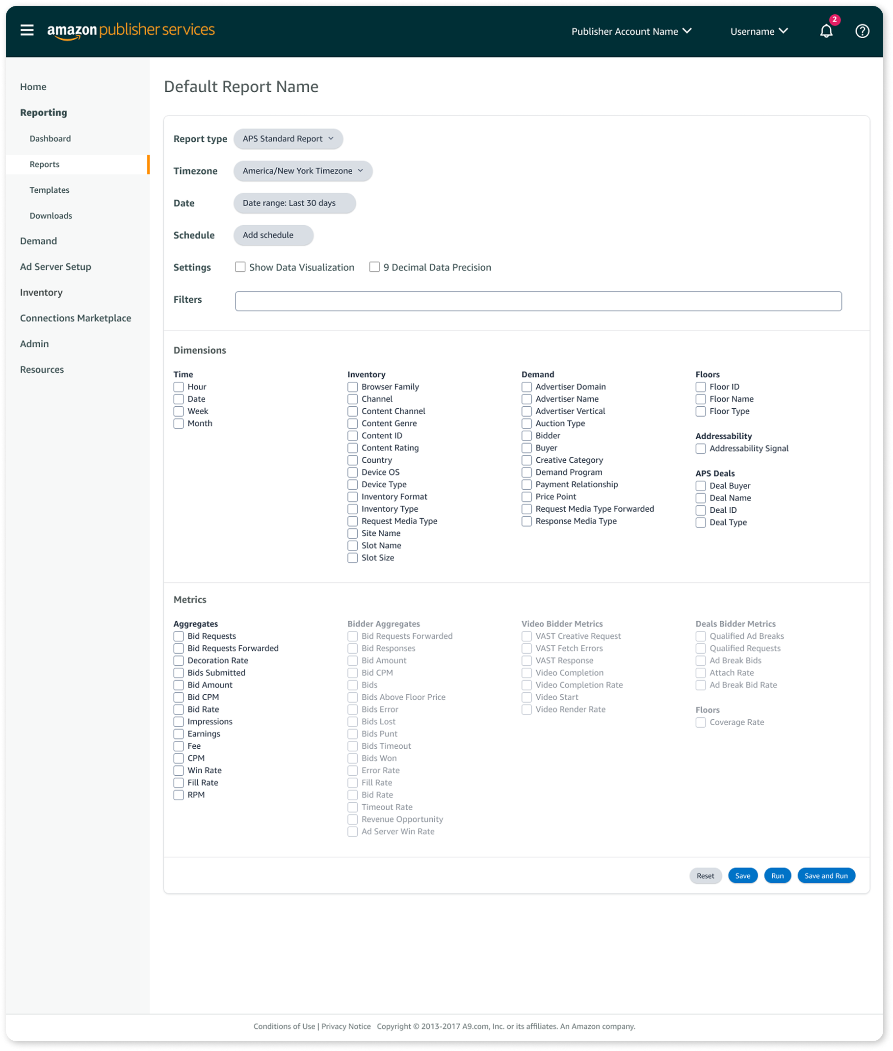
These were in addition to the basic reporting inputs required:
Date selection
Metrics
Dimensions
Filters
Based on the CRUD design pattern and the user journey, we also designed the following pages:
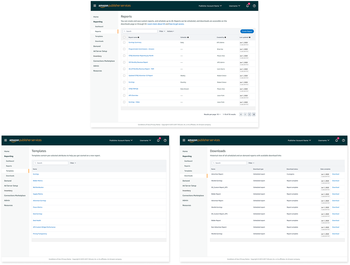
Manage reports
A data table displaying all saved reports.Report templates
A list of pre-built reports users can use as a starting point for new reports.Downloaded reports
A location where users can access completed scheduled reports.Report results
A page to display results when a user runs a report immediately.
Testing, Feedback and Iteration
We tested our feature early and often with a core group of customers throughout each stage of the build process. We used both design prototypes and beta versions for testing.
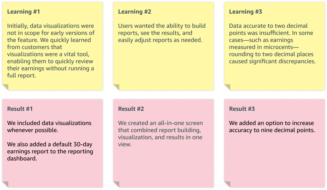
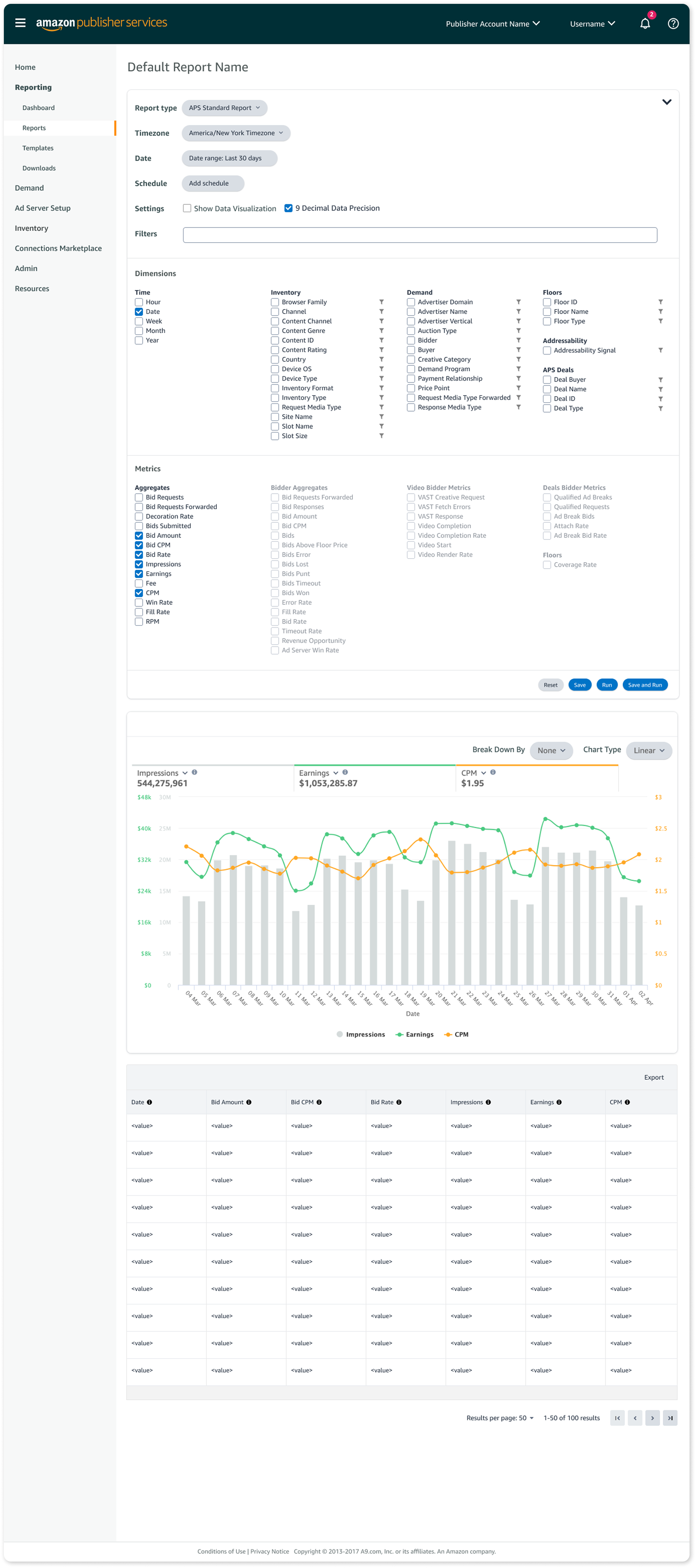
You can see the final result of this learning in the ability to edit and rerun reports directly from the results screen. We also included options for data visualization and data accuracy up to nine decimal points.
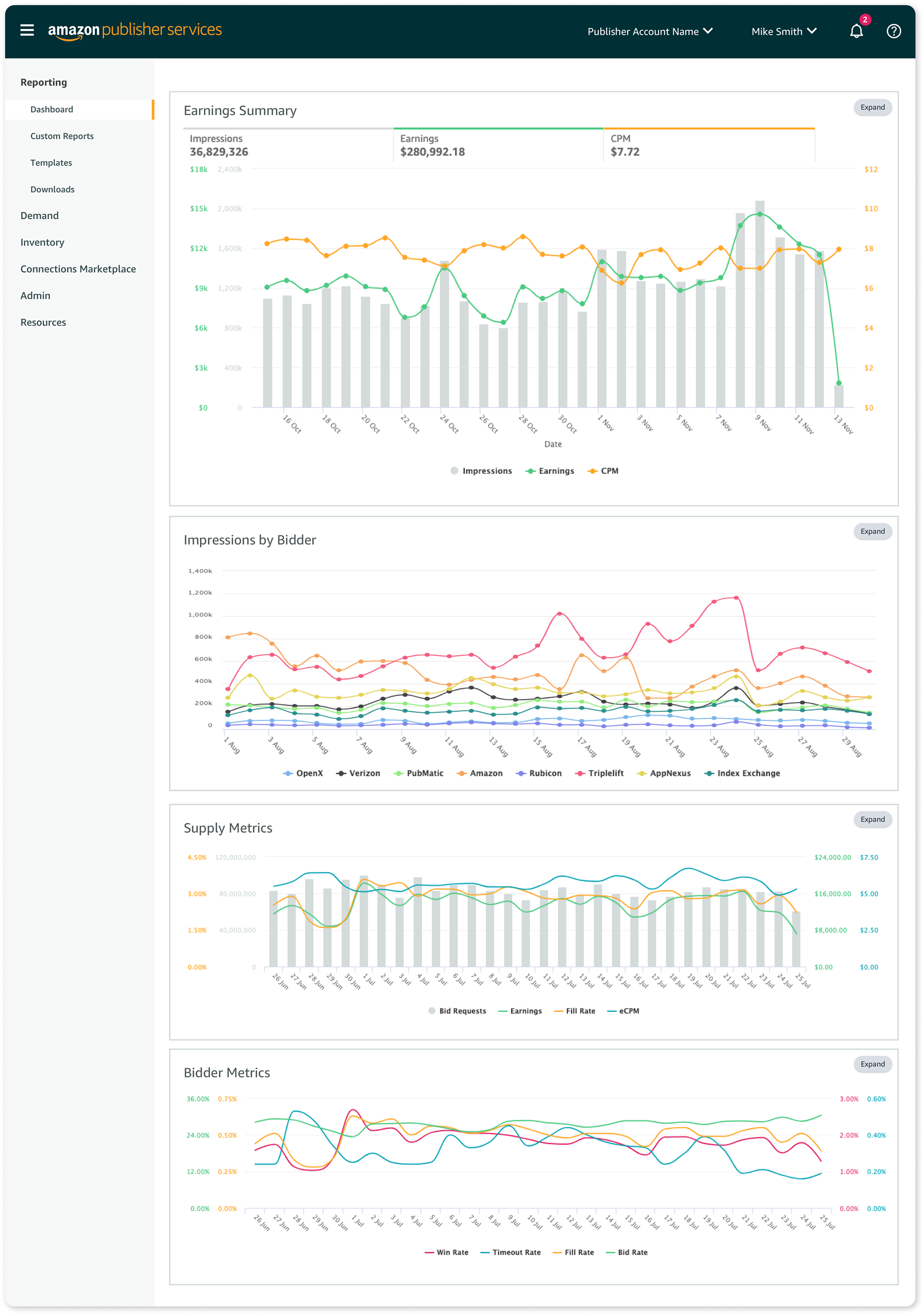
Lastly, we added the ability to pin favorite reports to the reporting dashboard.
Time to Launch!
Working with the Marketing team, we developed a go‑to‑market (GTM) plan to release the new reporting feature. The plan included deprecating and eventually sunsetting the legacy reporting feature, allowing customers to test the new Custom Reporting while still having access to legacy reporting as a fallback.
Because reporting is mission‑critical for our customers, we carefully released the new feature in small customer cohorts, monitored performance, and gathered feedback.
As we executed the GTM plan, we aligned UX design and in‑portal messaging to help customers learn about the new feature and set clear expectations for the full retirement of legacy reporting.
Reflection
After almost 3 years since the initial launch, my proudest accomplishment is the durability of the UX pattern. With minimal UX input, the data team has successfully added new metrics, dimensions, report types, and templates.
For me, this project is a reminder that thoughtful, scalable UX patterns can stand the test of time—and empower both customers and internal teams long after launch.