Amazon Publisher Services Branding
In late 2016, Amazon Publisher Services launched their first product and had an ambitious roadmap ahead. They was no branding, website nor marketing and we quickly needed to build a brand from the ground up. The first need was simple: a viable logo from which to build a broader identity and brand.
Identity
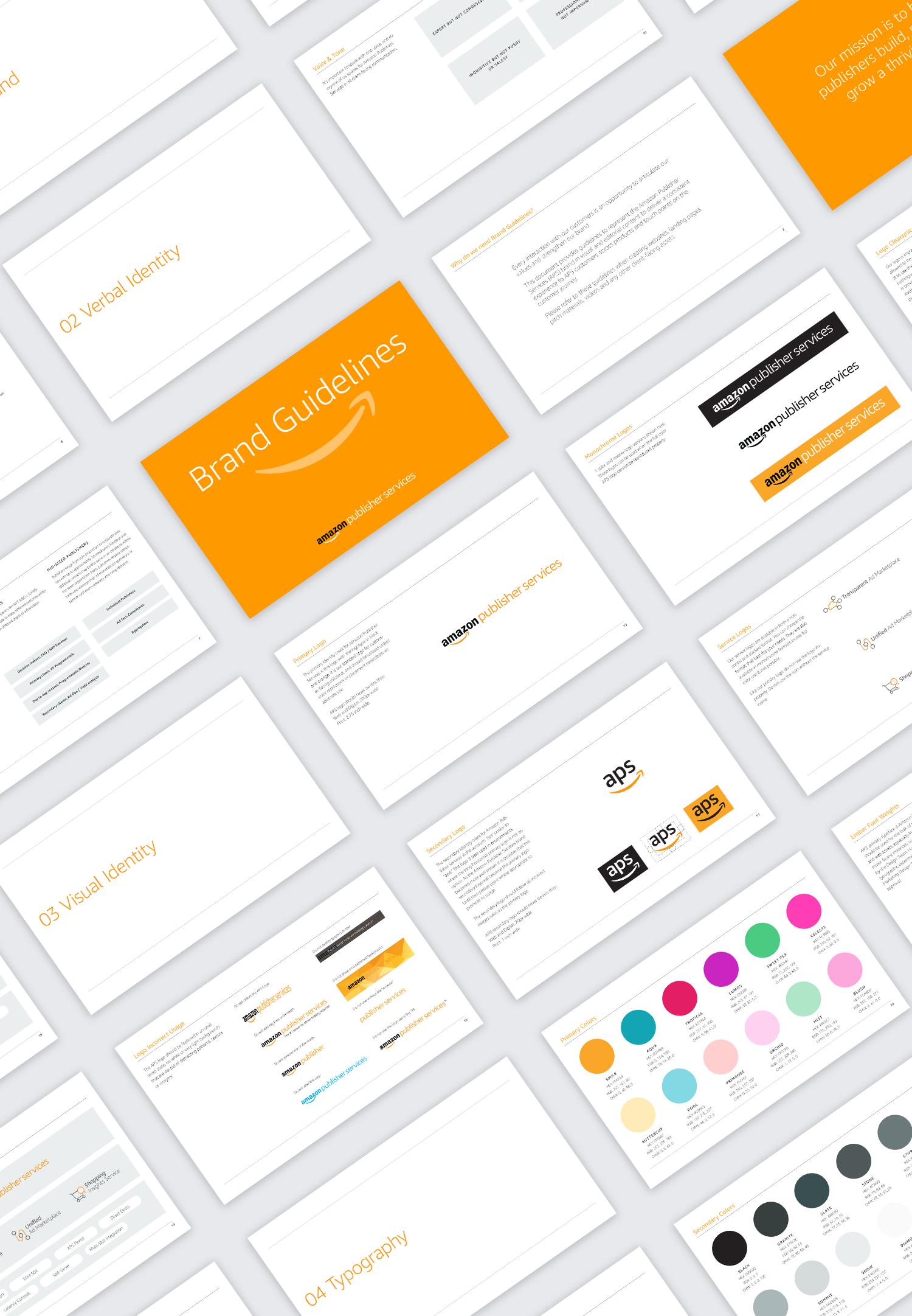
The existing Amazon Publisher Services logo was in dire need of help. Typographically, the logo had mis-aligned x-heights and baselines. The font weight of “Publisher Services” was kludgy and too similar to “Amazon”. To create the weight constrast needed, I created a custom font weight of Ember, the main Amazon font, that was somewhere between “medium” and “bold.” Lastly with the considerable length of our name, the logo kerning needed some tightening to maximize on space.
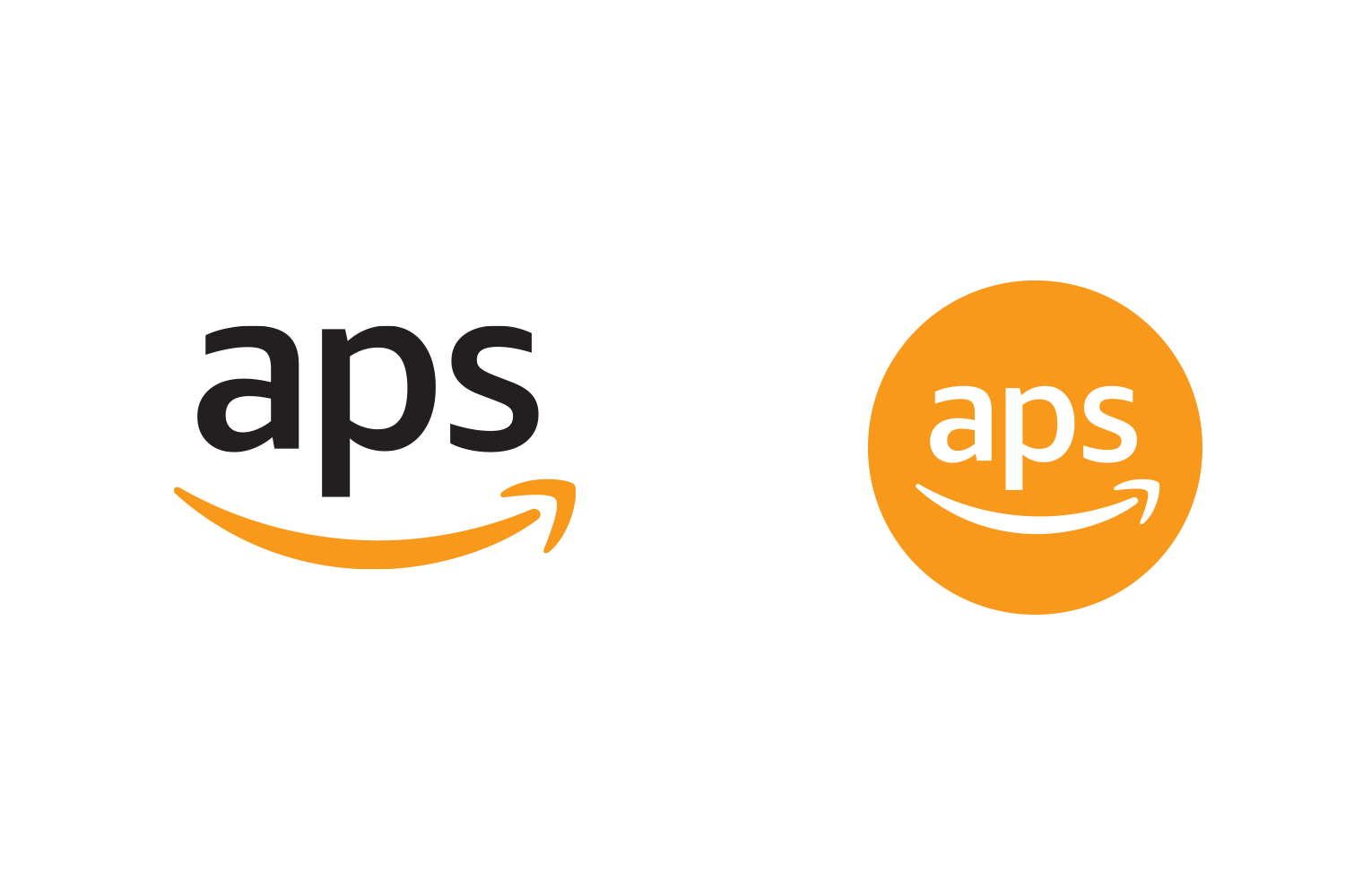
As we went to market with new products, we developed a suite of product logos. With each product launch, we also developed a matching color system thus further extending the brand. With increased recognition and brand equity, we decided to take a cue from Amazon Web Services, who was more well known as AWS, to expand our brand include the name of APS. We created a secondary logo and avatar to match.
Finally to tie everything together and achieve a consistent presentation of our brand, we created the APS Brand Guidelines. This included the standard do and do nots, logos, colors and fonts of a brand style guide but also a verbal identity outlining the proper voice and tone for communications.


Website
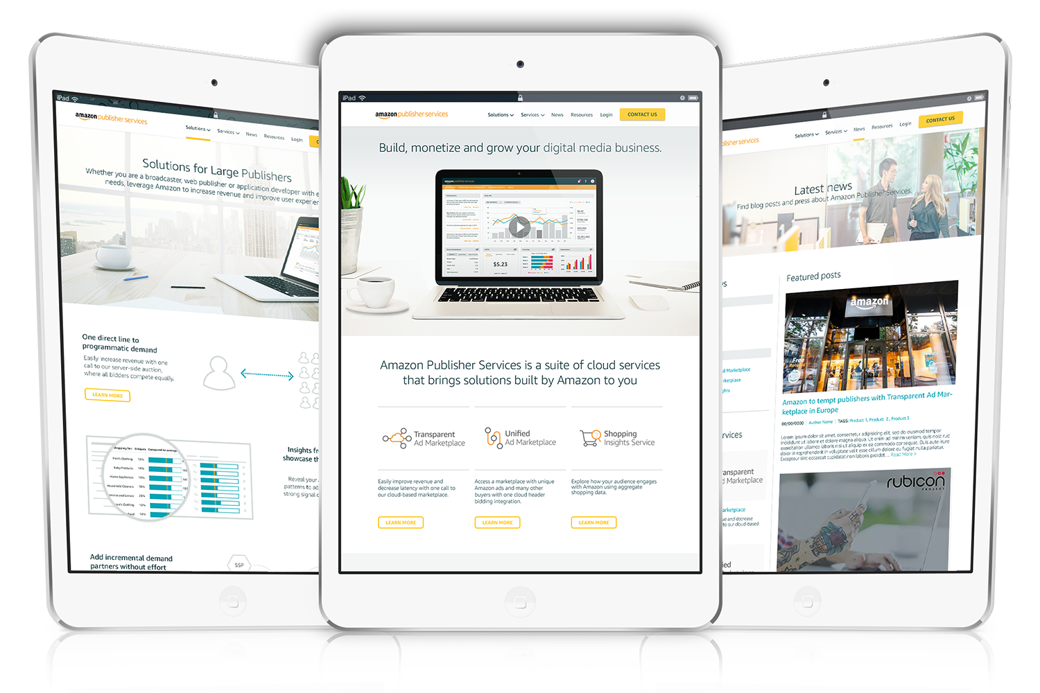
When I joined APS, the website was nothing but a single landing page with a contact us button. We were planning to rapidly expand our customer base to small and medium size publishers and needed a web presence for them to not only find more information but also as a critical path for outbound marketing and onboarding.
With a team of marketing and design, we crafted our messaging and a design to match. Through multiple iterative rounds with leadership, we landed on a final design concept and then engaged with an agency to bring our website to life. The website launched in late 2017.
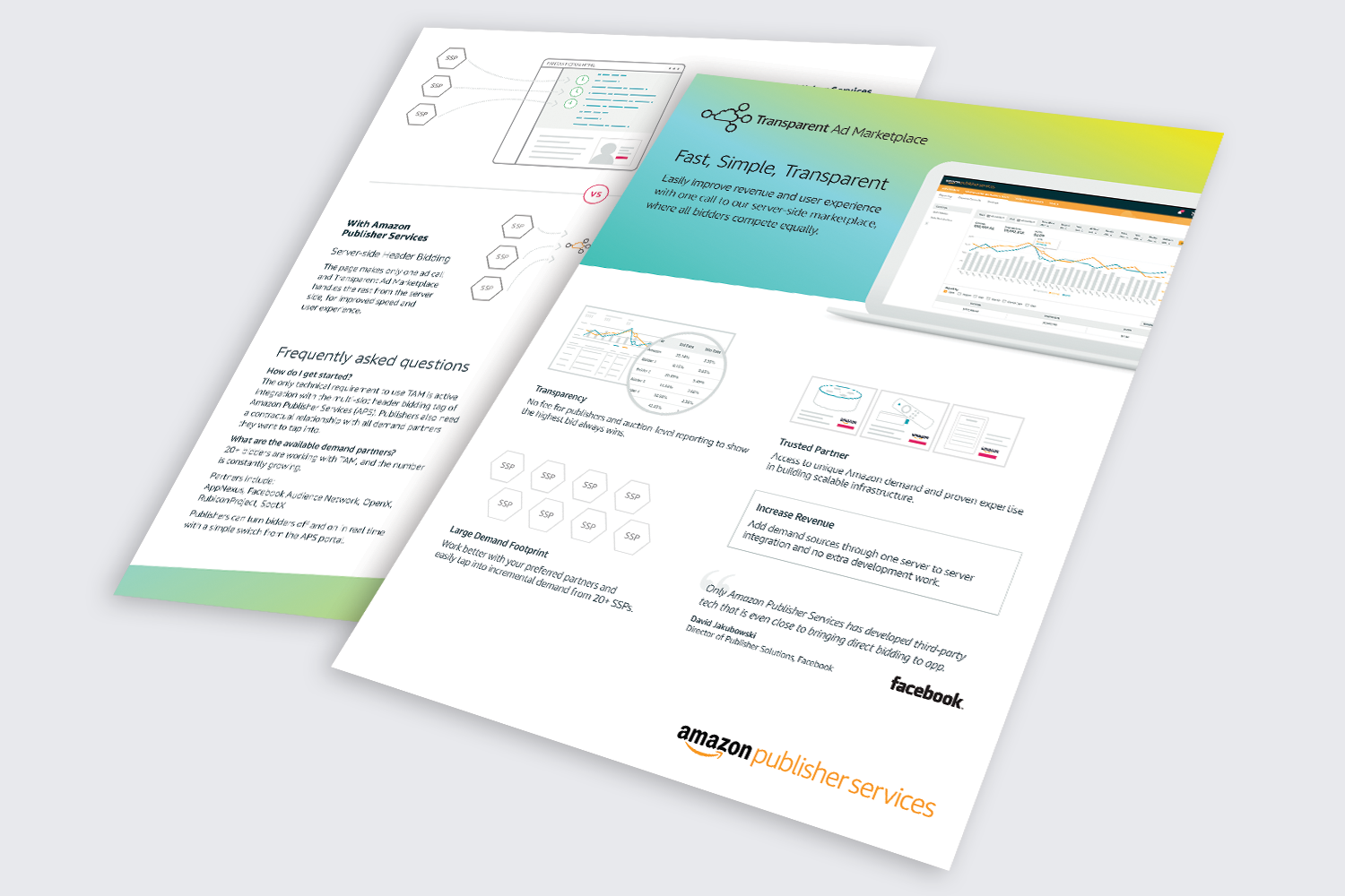
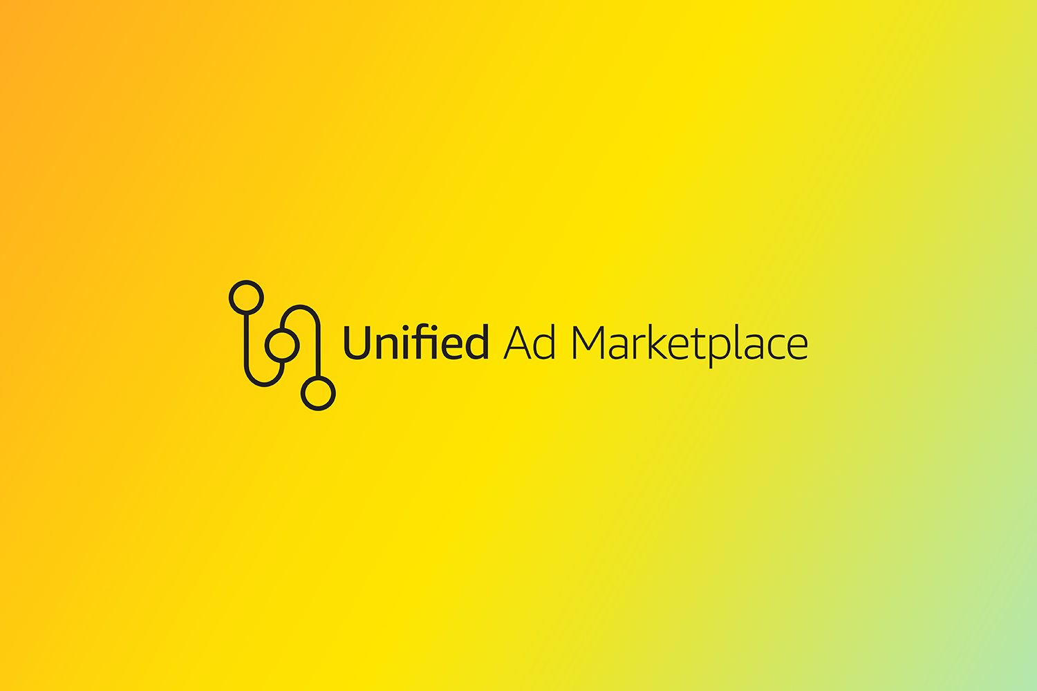
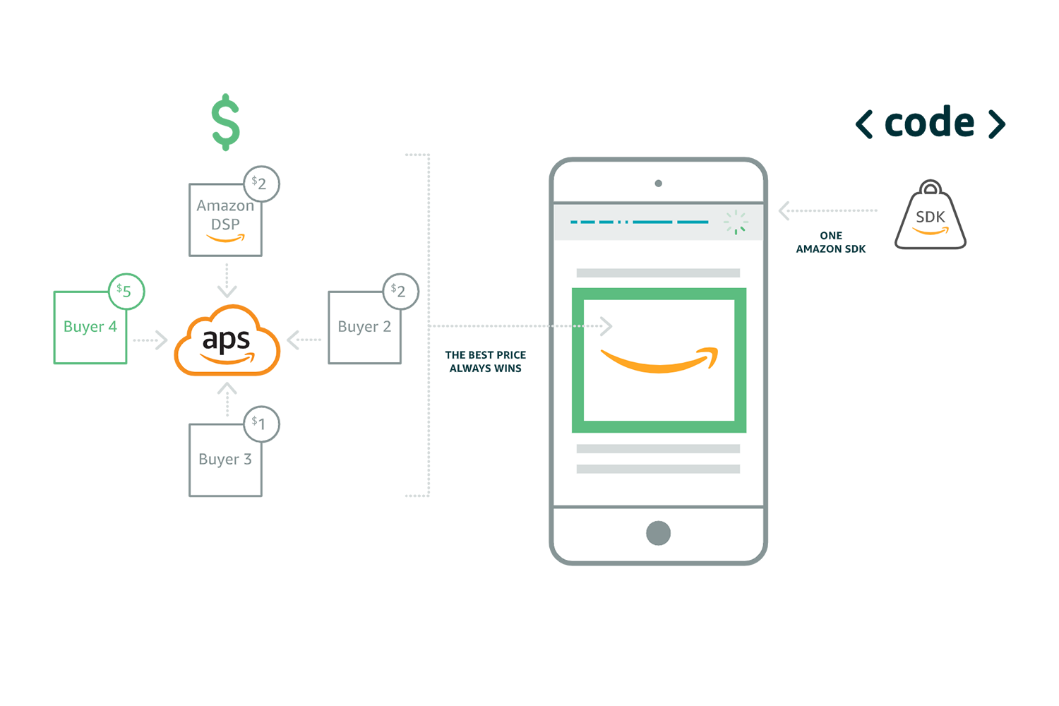
Icons and Illustrations
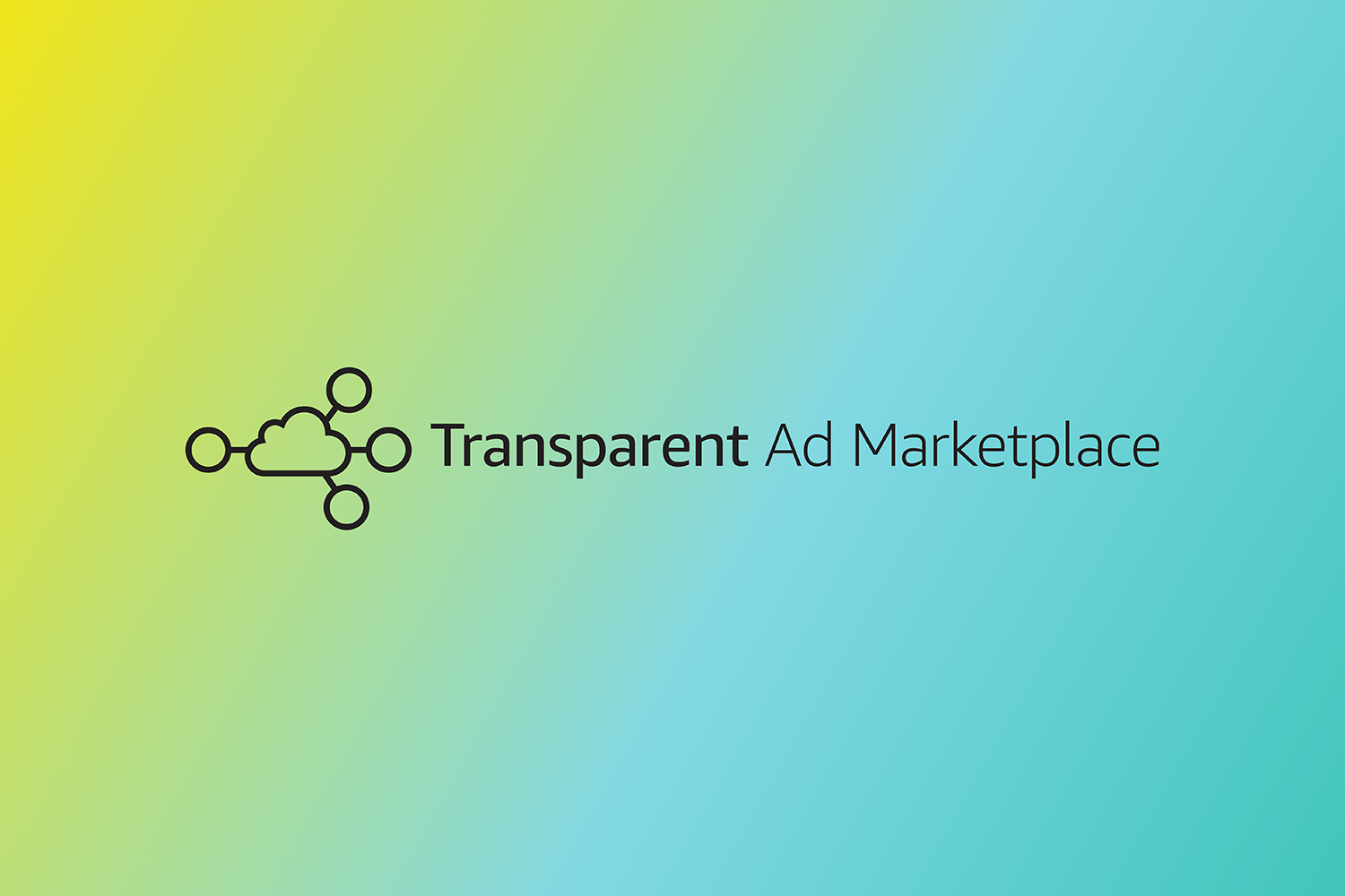
As part of the website design, I created a unique set of custom icons and illustrations. They were needed to support and explain concepts that are unique to APS and adtech. The icons were extended to diagrams explaining the advantages of our product and were included in both the website and marketing collateral.
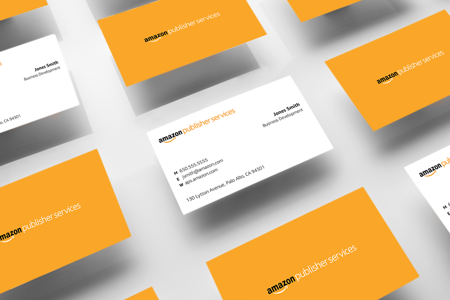
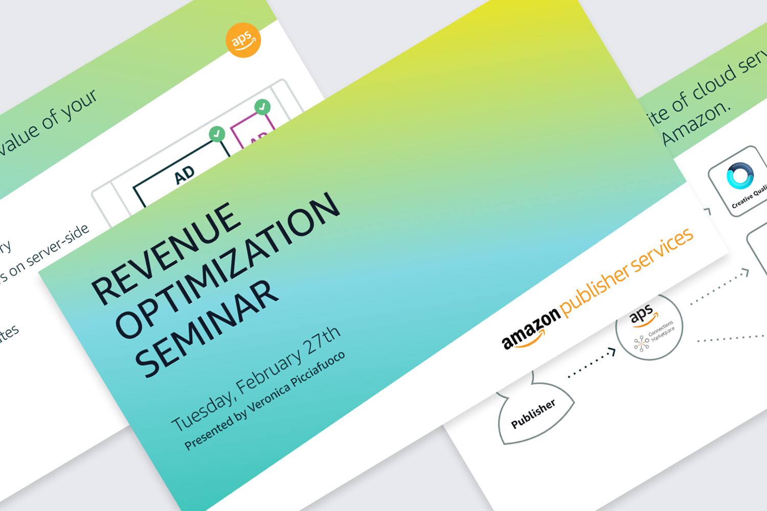
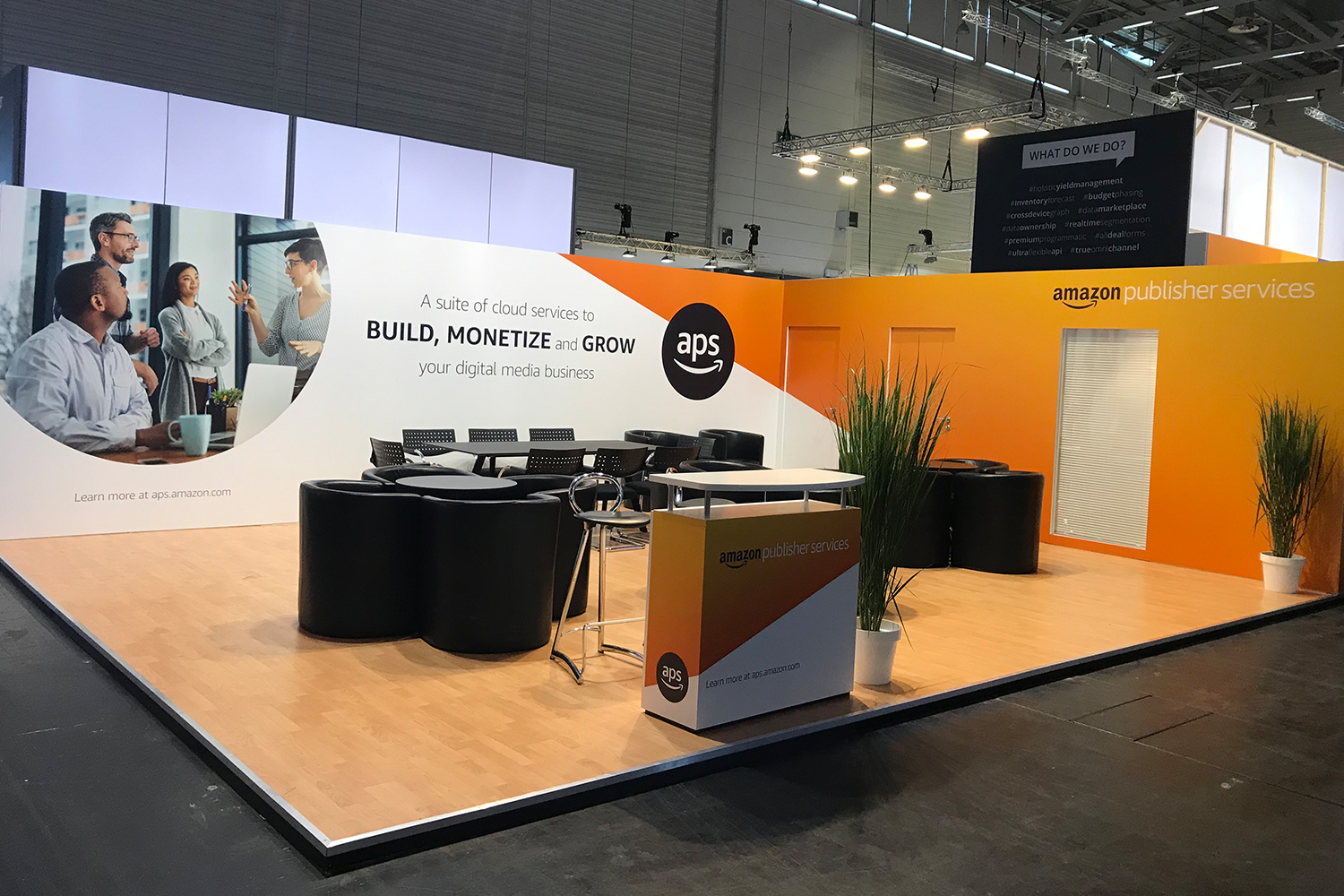
Marketing Collateral
By leveraging our brand guidelines and existing assets, we created a series of product brochures, case studies, powerpoint templates and trade show visuals. Different color palettes are used to tie back to distinct product verticals however the identity, shapes and iconography work to bring all the branding together as a whole.