Atmosphere Design System
In 2017, I was hired by Amazon Publisher Services (APS) to start building new products for our customers. From the start, I advocated for building a design system to help aid our design and development teams to build consistent UI and build them with speed. Although a design system for the retail experience existed at Amazon, it was clear that this would not fit the needs of our advertising technology focused customers.
Thus, the APS Atmosphere Design System was born. Based on the “Atomic Design” concept for design systems where the smallest components “atoms” are used to build ever bigger components “molecules” and “organisms.”
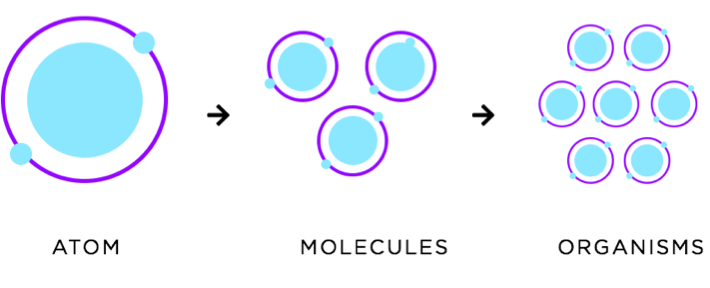
Creating molecules and organisms that focused on the complex needs of adtech customers was crucial to quickly designing and developing key business products and features. With a standardized design system. APS was able to achieve a consistent UX and UI approach to create a better user experience and delight our customers.
Design System Guidelines
Color
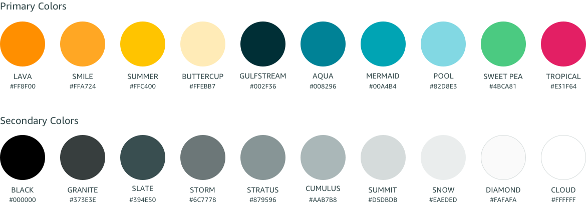
The Atmosphere Design System uses a shared palette of colors for creating components. The colors help define usage patterns such as check marks are green and warning notifications are red. Colors will also define which components are interactive as well as create a visual hierarchy to highlight the most important elements. Lastly, the color palette will be a way to promote brand consistency throughout the user experience.
Typography
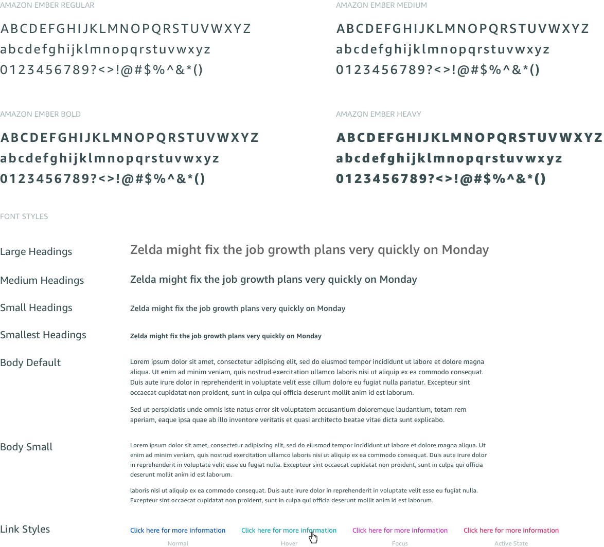
Ember is the official digital font for Amazon. It is a comprehensive family of sans serif designs optimized for maximum legibility on digital displays. Friendly and approachable, its large counters and generous x-height are tuned for mobile, desktop, and the living room. It is offered in 6 weights however we opted to only use 4 of the weights. The 2 thinnest weights were deemed too thin for good contrast and legibility.
Iconography
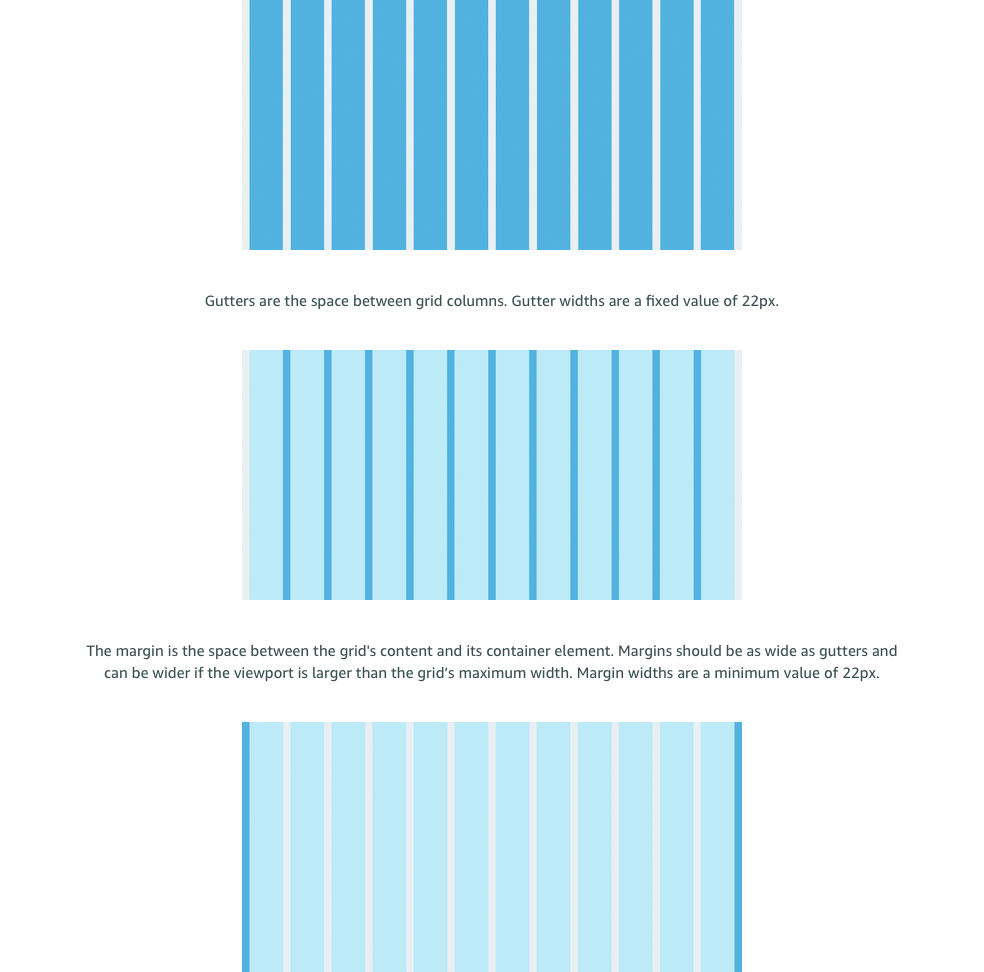
Page Layout
Using consistent page layouts and layout components helps orient customers in their workflow, in addition to speeding up the design and development of new pages. A grid system is an invisible lines and columns structure that allows better layout or content alignment. It also provides layout consistency across multiple pages, screen sizes, and devices. There are 12 column grid units in the grid system. Column widths vary by viewport size.