Amazon Publisher Services Information Architecture Redesign
Established in 2016, Amazon Publisher Services(APS) is a suite of cloud services for digital publishers to build, monetize and grow their media businesses. As a supply side platform, a service that provides advertising supply to fulfill publisher advertising inventory, APS is second only to Google. We integrate with publishers by placing our header bidding code on websites, mobile apps, TV apps and more.
Our customers use the APS portal to access onboarding flows, documentation, downloads, reporting and more. Tens of thousands of websites across thousands of publishers use the APS portal to ensure that millions of ad impressions are served to their users.
The Problem
Back in 2017, the APS portal was a single experience for all customers. As we grew, so did our customer base and like many companies we segmented our customers into different groups to better serve them. Which each new customer segment, the portal information architecture(IA) of each customer type also evolved to give customers the best experience possible at the time.
As we launched new tools and features, it became clear that each customer IA had become fragmented and inconsistent with each other. It could no longer serve APS or customers needs effectively. When new features launched, we placed them in what were logical but ultimately different places in the portal for each customer type. Eventually, we were trying to fit round pegs into square holes and further fragmenting the information architecture.
Teams eager to build new out new features have also created an inconsistent navigation structure combining both horizontal and vertical based navigation UI. Adding to the problem was the inconsistent usage of language for similar pages. This confused not only our customers but internal team members as well.
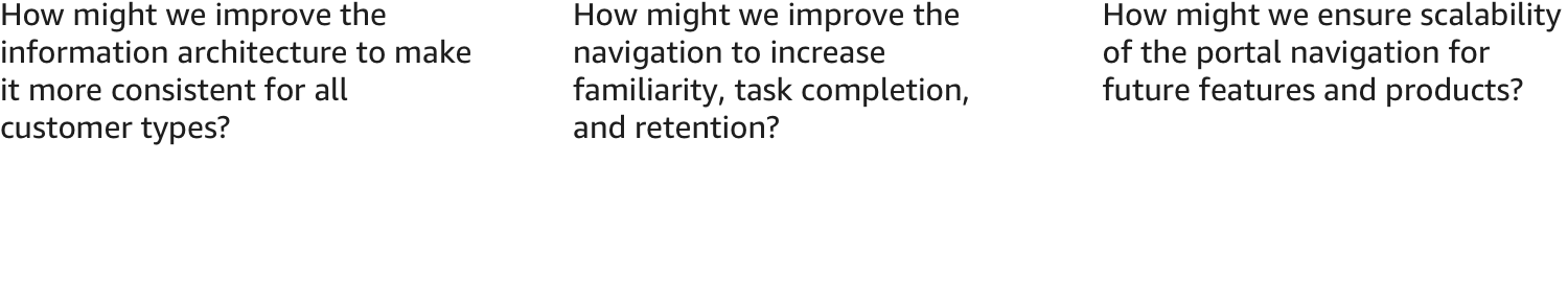
We posed the problem as a set of “How might we” questions.
My Role + The Team
This was a project that led with design thinking and we bootstrapped it from the beginning. Product managers were focused on the needs and features of individual customer types. A wholesale change in IA and navigation were problems that we faced at the company level and no specific person was responsible for fixing it. Despite this, a UX designer and I pushed ahead without much initial support. We started a discovery process with both internal users and customers and continued the design process from there.

The Design Process
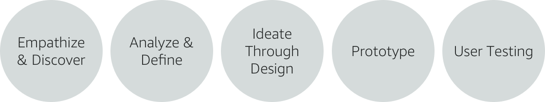
Empathize & Discover
Research and competitive landscape
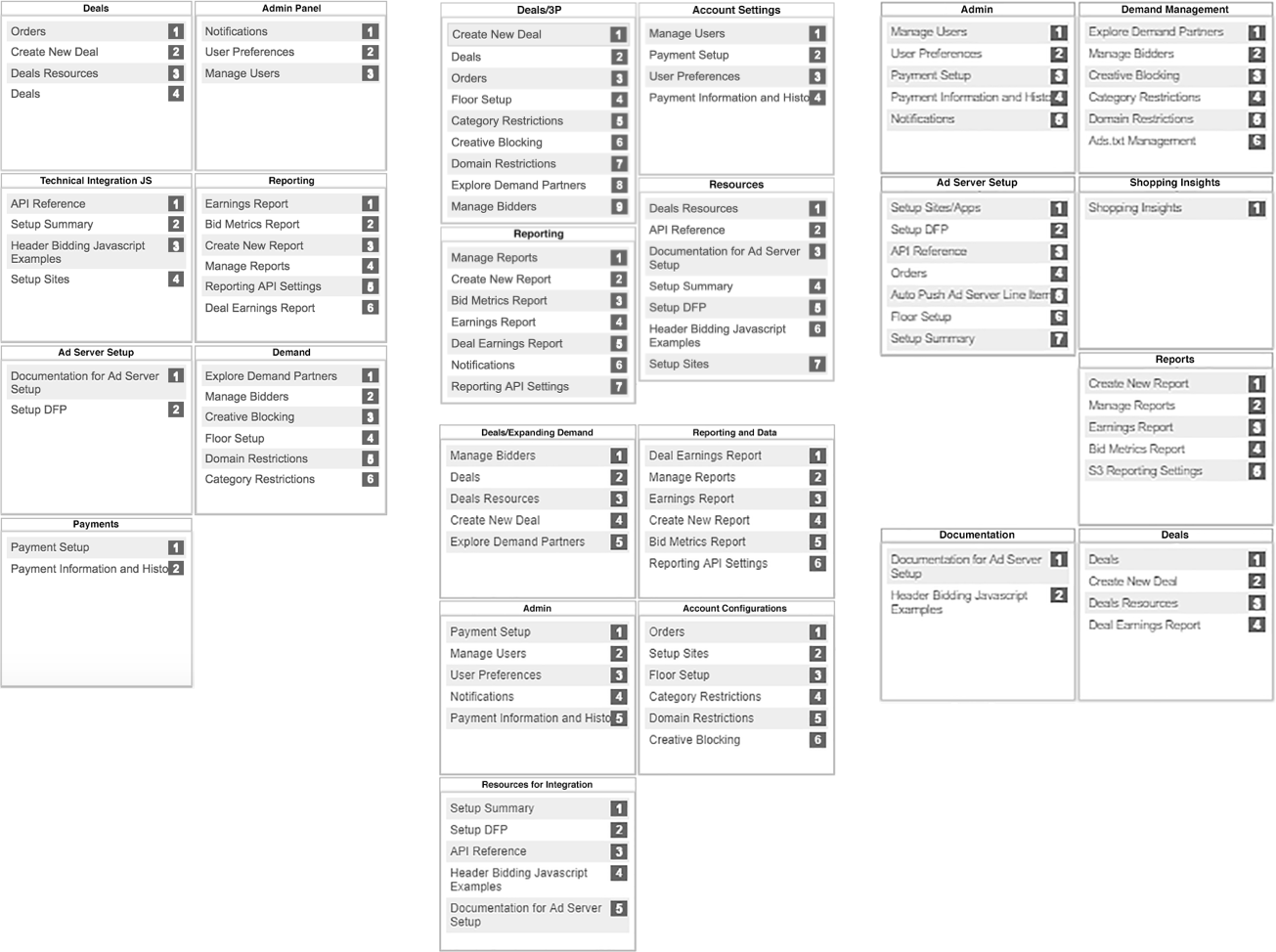
Among our competitors and partners, there were some common themes and naming conventions that we believed would make sense for our business and that customers would be familiar with. However, APS also has unique features and onboarding flows that we needed to address how they would fit into this new information architecture. However, we first audited our existing IA across our customers to identify where we had differences, similarities and redundancies.
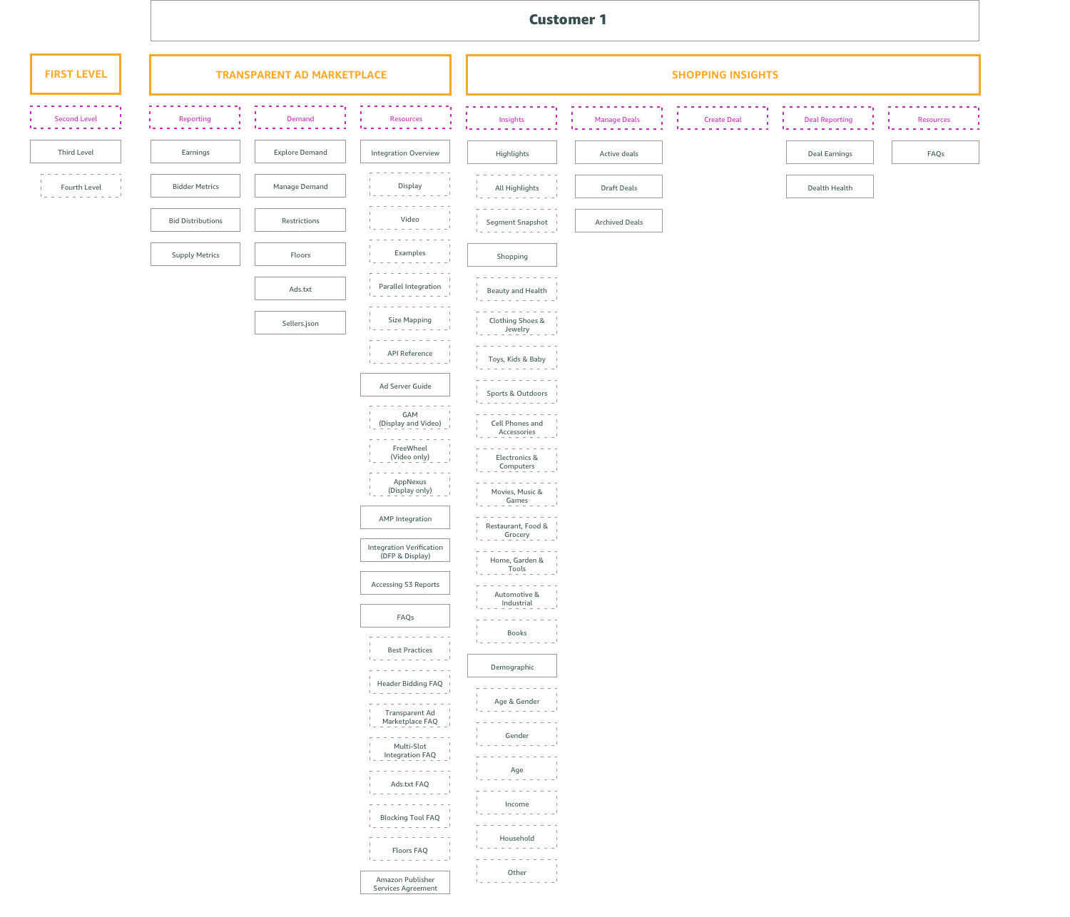
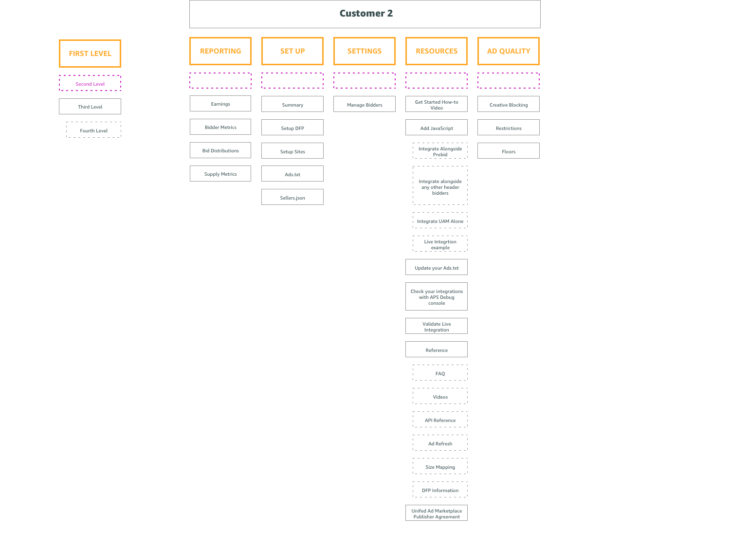
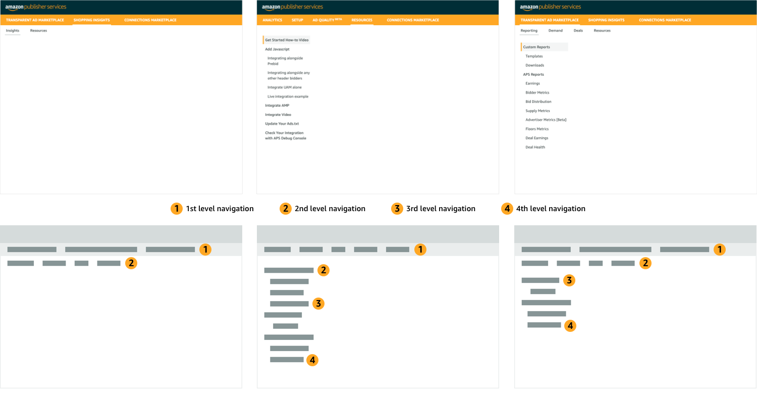
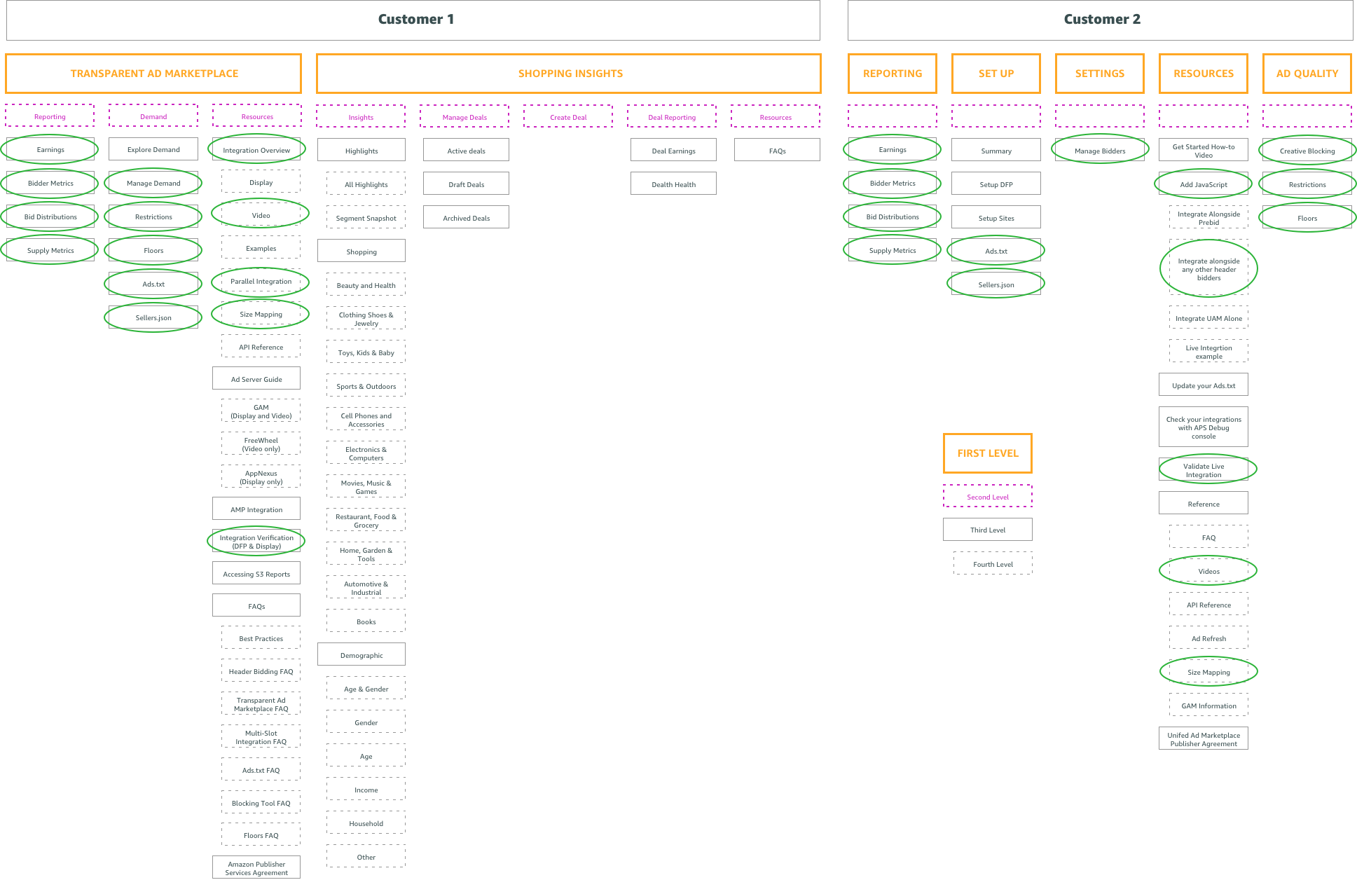
You can see from the examples above that these 2 customer types have very different structures. However, upon closer inspection you can see they actually share many common features and pages as illustrated in the circles below.
Lastly, you can see, the site structure can get very deep into 3rd and 4th level navigation necessitating many click throughs to access deeper pages. Users need to wait to load multiple page menus to reveal deeper available menus as they click through resulting in a slow user experience.
User survey and initial internal interviews
When we started interviewing users, we started with our most knowledgable users, our own internal account managers. They best understand the needs of our customers and business. We created an internal survey that was like a pseudo card sorting exercise. We gave a list of features and site pages and asked users to sort these into groups. Even at this very early stage, we were able to gather some data points and some early trends started to emerge.
Discovery workshop
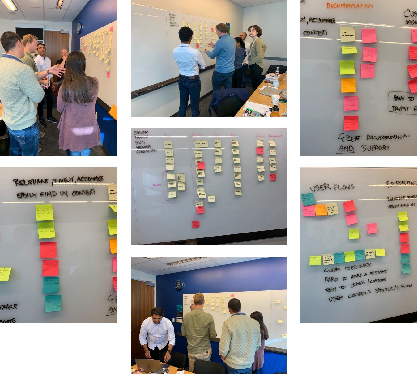
Many of our essential team members gathered in Austin, TX for internal meetings and I used the opportunity to run a discovery workshop. With a mix of leadership, account managers and developers, we split up into two teams. I setup a card sorting exercise where I wanted each group to create their own information architecture. At the end of the exercise we discussed the pros and cons of each solution, combined the best ideas from each and settled on a winner.
Analyze & Define
One information architecture to rule them all
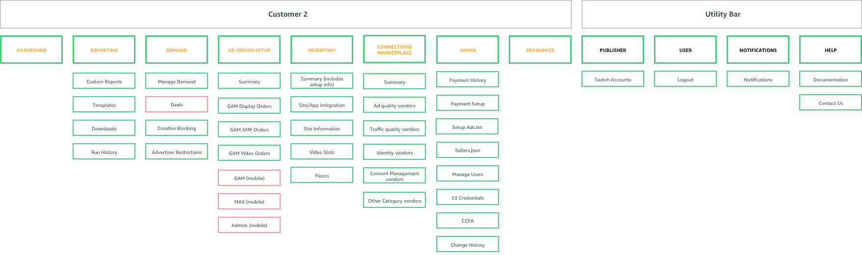
To achieve consistency and flexibility across multiple customer types, we created an “umbrella” modular information architecture. The new navigation creates a single unified model with consistent language, so that the experience of using APS is clear, cohesive, and scalable.
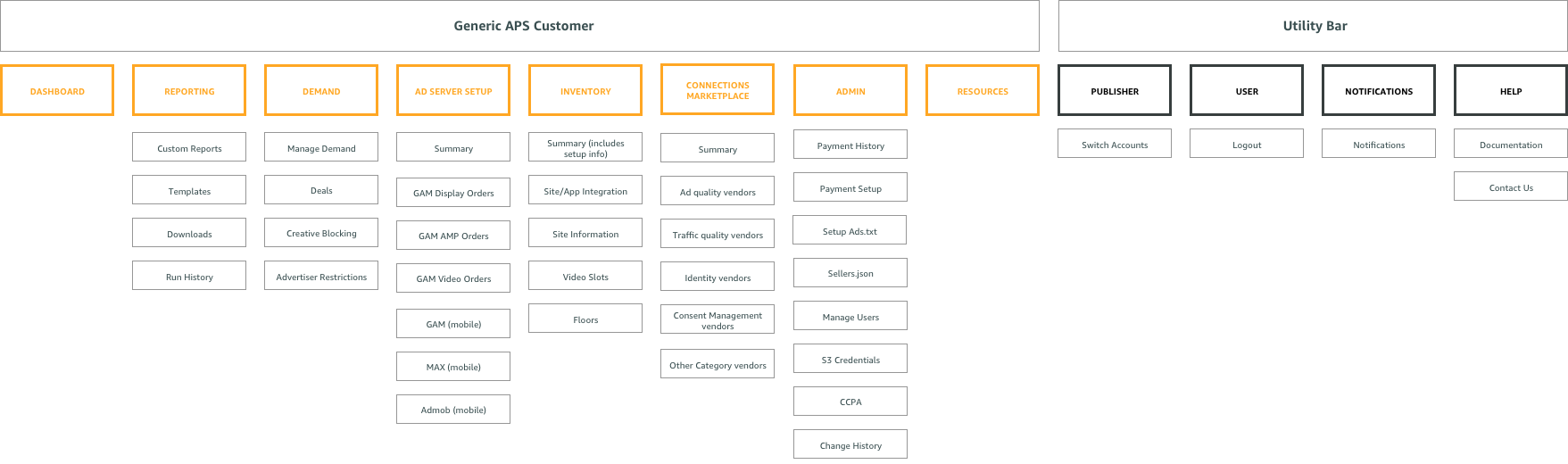
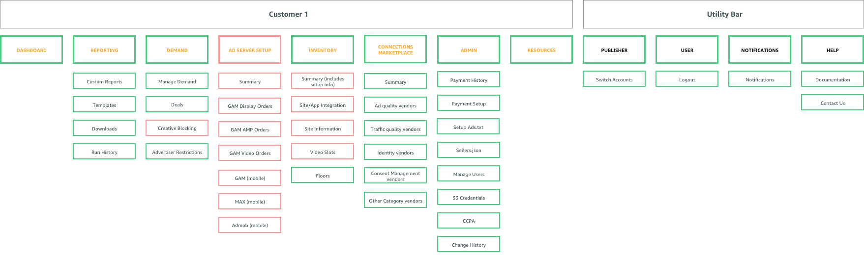
By picking and choosing which pages we need from the “umbrella” information architecture for specific user types, we can ensure a consistent experience across all users. In the example below you can see how we created the information architecture for “customer 2.” You can see the pages we selected (green) and omitted (red) for customers 1 and 2 in the examples below.
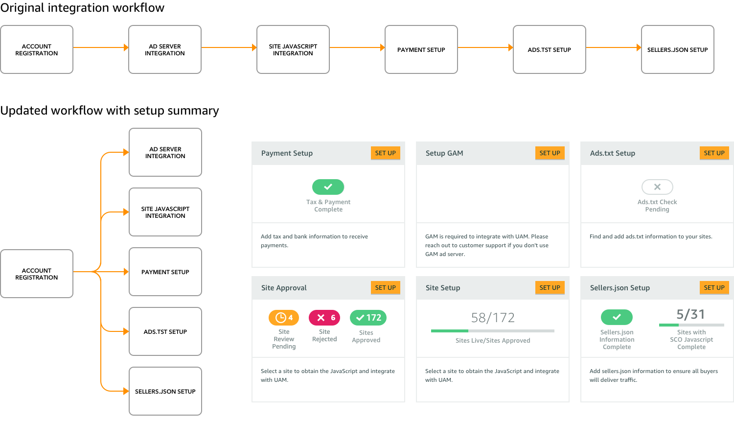
Maintaining the onboarding workflow
For many of our customers, the primary function of the portal is for onboarding and integrating their websites and apps with APS. When we first version of this workflow was primarily a linear one where we walked publishers through step by step. With the new IA we knew we would be breaking up this workflow into multiple sections for scability but we needed to maintain a efficient way for new publishers to still onboard.
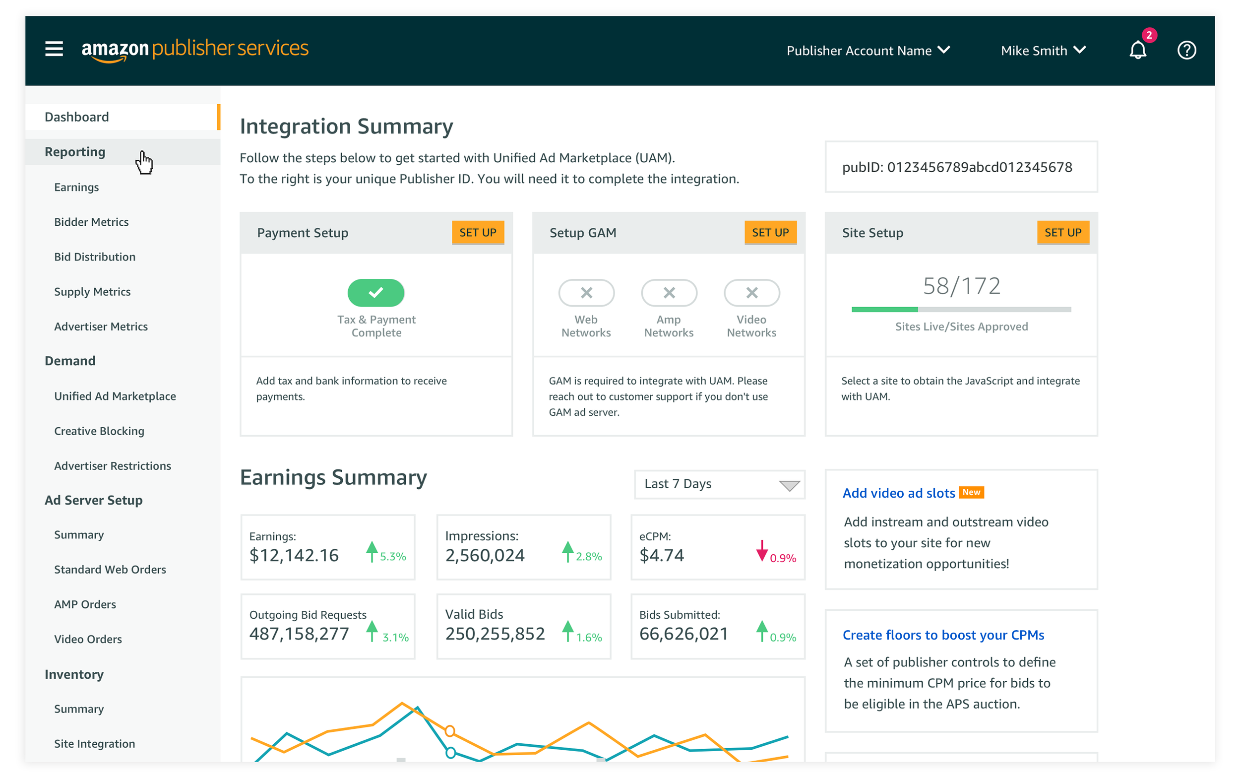
We introduced an onboarding summary and placed it on the publishers homepage. Upon logging in, users could immediately identify which onboarding tasks still needed to be completed.
A new UI for better navigation and task completion
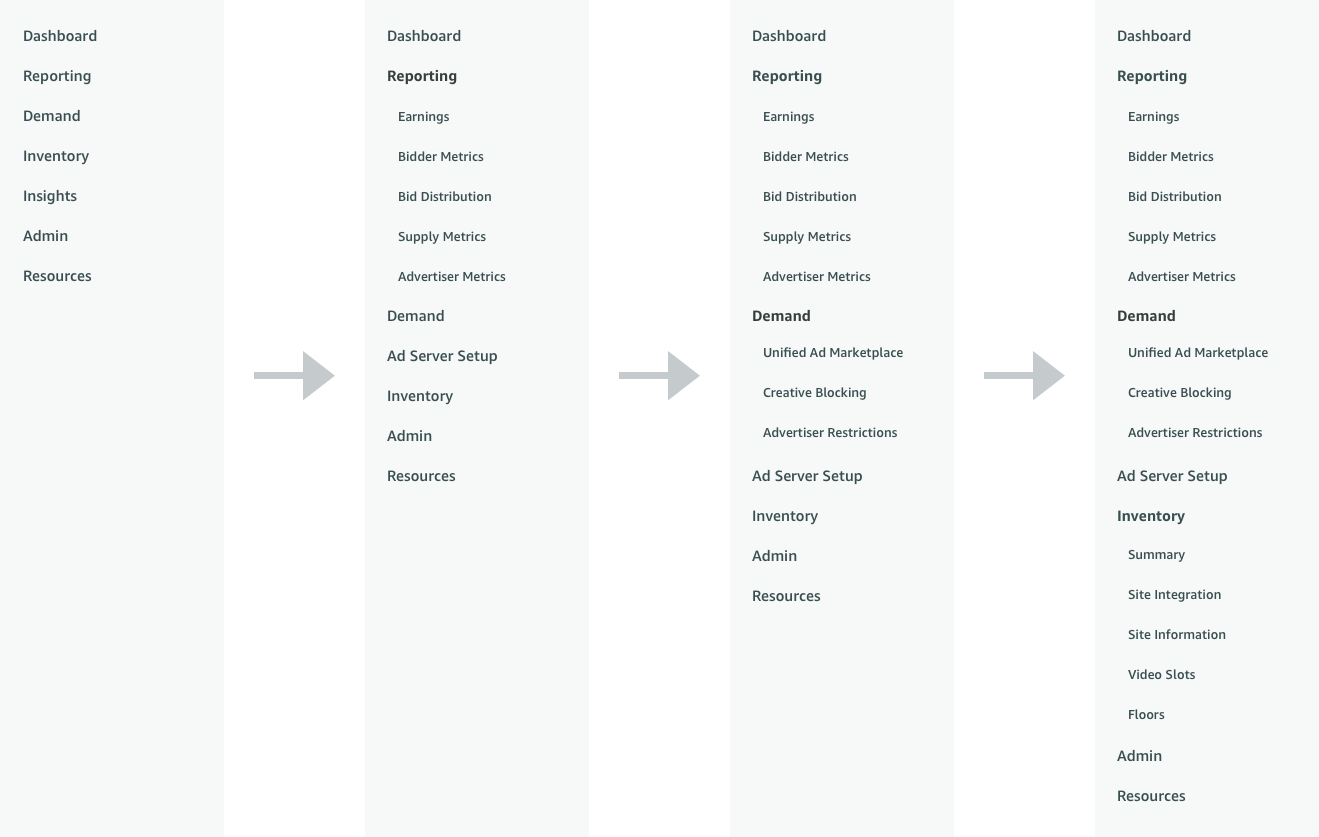
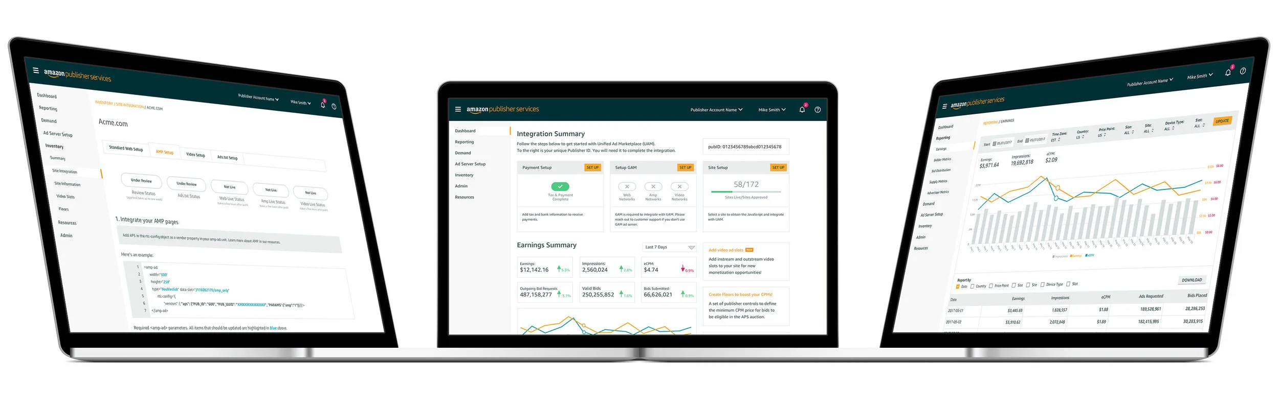
Based on early user testing and feedback from customers, it was clear that some users would sometimes lose their place in the UI. The placement of horizontal top level navigation AND vertical left side navigation was confusing for some users. It was clear that we needed to unify the navigation to just one area of the UI. To ensure it was scalable for the future, a left hand side navigation was the obvious choice. Furthermore, to make it easy to browse and locate pages, we added an accordian style navigation feature. Users could open and close every section of the navigation to reveal the pages underneath.
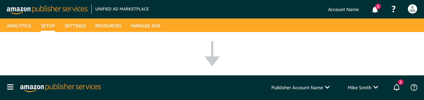
One of the most valuable sections of our portal is our documentation for integration and FAQs. We separated out our documentation into its own portal so users could also easily navigate through its many layers without the distraction of other portal features. For the header, we removed the horizontal navigation and further improved it. We added a menu button to open/close the navigation and added clearer context for the account and user name.
Ideate Through Design
A UI and navigation refresh
To achieve consistency and flexibility across multiple customer types, we created an “umbrella” modular information architecture. By creating an information architecture that we can add and subtract from as we need to for specific user types, we ensure that we provide a way for users to grow with us without having to continuously struggle to locate new features in the portal. The new navigation creates a single unified model with consistent language, so that the experience of using APS is clear, cohesive, and scalable.
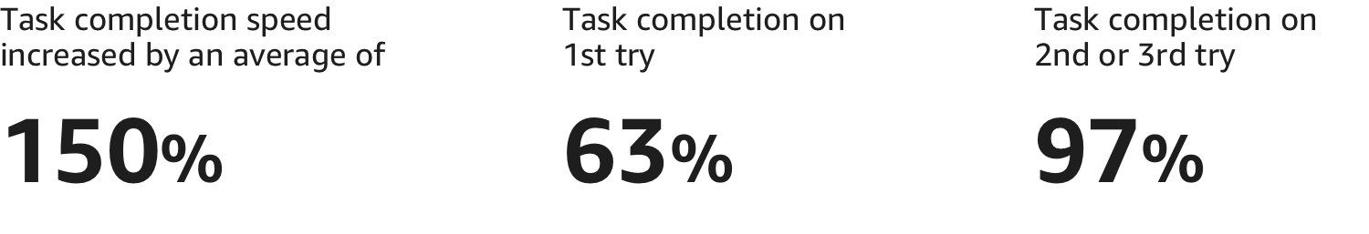
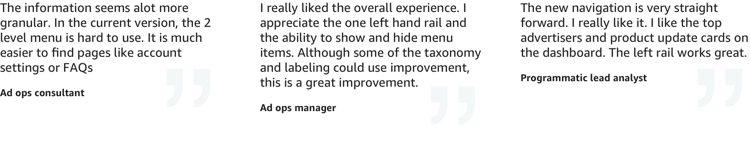
User Testing & Results
Throughout the process, we built an invision prototype to test against users both internal and external. We measure task completion by asking users to locate specific pages within the new information architecture using the new navigation structure. Users were already familiar with the top level categories based on similarities with competitors. The new accordian style navigation let users quickly browse through each category. Even if users did not find what they were looking for on their first try, it only took them a few extra clicks to find it on their 2nd or 3rd guess.